Css样式
文本换行
word-break指定了怎样在单词内断行。white-space用于设置如何处理元素内的空白字符。overflow-wrap是否应该在一个本来不能断开的字符串中插入换行符,以防止文本溢出其行向盒。与 word-break 相比,overflow-wrap 仅在无法将整个单词放在自己的行而不会溢出的情况下才会产生换行。
/* 在任意位置断行 */
word-break: break-all;

/* 文本不断行 */
word-break: keep-all;

/* 不允许换行 */
white-space: nowrap;

/* 连续的空白符会被保留。仅在遇到换行符或 <br> 元素时才会换行 */
white-space: pre;

/* 连续的空白符会被保留。在遇到换行符或 <br> 元素时,或者根据填充行框盒子的需要换行 */
white-space: pre-wrap;

/* 连续的空白符会被合并。在遇到换行符或 <br> 元素时,或者根据填充行框盒子的需要换行 */
white-space: pre-line;

/* 行只能在正常的单词断点(例如两个单词之间的空格)处换行 */
overflow-wrap: normal;

/* 如果行中没有其他可接受的断点,则允许在任意点将通常不可断的单词换行 */
overflow-wrap: break-word;
网站全局黑白色
/**
 * 全局黑白色
 * 须在html上设置
 */
html {
  -webkit-filter: grayscale(100%);
  -moz-filter: grayscale(100%);
  -ms-filter: grayscale(100%);
  -o-filter: grayscale(100%);
  filter: grayscale(100%);
  filter: progid:DXImageTransform.Microsoft.BasicImage(grayscale=1);
}

/**
 * 黑色主题
 */
html {
  -webkit-filter: invert(1) hue-rotate(180deg);
  filter: invert(1) hue-rotate(180deg);
}
自定义光标
/* 除浏览器默认支持的光标,还支持自定义图片,.ico 或 .cur格式 */
/* 建议:1、图片地址为绝对路径,2、图片大小最好是32*32 */
div {
  cursor: url(../gitbook/images/favicon.ico), auto;
}
水平垂直居中
<div class="center">
  <span>水平垂直居中</span>
</div>
/* 默认初始化样式 */
body {
  height: 500px;
}
.center {
  height: 20%;
  border: 1px solid #666;
}

/* 1、flex水平垂直居中,👍推荐使用🔥 */
/* 设为 Flex 布局以后,子元素的float、clear和vertical-align属性将失效 */
.center {
  display: flex;
}
.center >span {
  margin: auto;
}
/* 衍生写法,可直接居中容器中的文本 */
.center {
  justify-content: center;
  align-items: center;
}

/* 2、grid水平垂直居中 */
/* ❗ 注意兼容性要求浏览器版本较高 */
.center {
  display: grid;
}
.center >span {
  margin: auto;
}

/* 3、line-height水平垂直居中 */
/*
父节点固定px高度
*/
.center {
  text-align: center;
  height: 100px;
  line-height: 100px;
}

/* 4、绝对定位水平垂直居中 */
/*
子节点固定px高度
.center {
  text-align: center;
  position: relative;
}
.center span {
  position: absolute;
  top: 0;
  left: 0;
  right: 0;
  bottom: 0;
  margin: auto;
  width: 200px;
  height: 21px;
  text-align: center;
}
*/
/*
衍生写法,❗ 基于Chromium的浏览器中会导致文本的模糊问题 ❗
top、left偏移父容器的50%,通过transform: translate偏移自身-50%实现居中
可不设置子节点宽高
*/
.center >span {
  position: absolute;
  top: 50%;
  left: 50%;
  transform: translate(-50%, -50%);
  text-align: center;
}

/* 5、伪类水平垂直居中 */
/*
容器before伪类生成一个行内节点,高100%,宽1px,margin-right: -1px,消除1px的占用
容器所有子节点都需要设置vertical-align: middle
容器通常情况下字体大小不为0,代码的换行符会占用一个字符的位置,此处应将容器字体大小设为0,内容节点中重新设置字体大小
*/
.center {
  text-align: center;
  font-size: 0;
}
.center::before {
  content: "";
  display: inline-block;
  height: 100%;
  width: 1px;
  margin-right: -1px;
  vertical-align: middle;
}
.center span {
  font-size: 16px;
  vertical-align: middle;
}

/* 6、table-cell水平垂直居中 */
/*
父容器宽度默认内容宽度
当display: table时,padding失效
当display: table-row时,margin、padding失效
当display: table-cell时,margin失效
*/
.center {
  display: table;
  width: 100%;
}
.center span {
  display: table-cell;
  vertical-align: middle;
  text-align: center;
}
文本超出省略号
/**
 * 单行文本
 * 注意:固定宽度
 */
.text {
  overflow: hidden;
  text-overflow: ellipsis;
  white-space: nowrap;
}
/**
 * 多行文本
 * 注意:固定宽度,容器padding属性会导致文本无法隐藏
 * 只适用于WebKit内核的浏览器
 */
.text {
  display: -webkit-box;
  -webkit-box-orient: vertical;
  -webkit-line-clamp: 2;
  overflow: hidden;
  text-overflow: ellipsis;
}
CSS 实现多行文本“展开收起”
<div class="wrapper">
  <input id="exp-check" class="exp" type="checkbox">
  <div class="text">
    <label class="btn" for="exp-check"></label>
    很长的文字内容 ... ...
  </div>
</div>
.wrapper {
  display: flex;
  width: 600px;
  overflow: hidden;
  border-radius: 8px;
  padding: 15px;
  box-shadow: 20px 20px 60px #BEBEBE, -20px -20px 60px #FFFFFF;
}
.text {
  font-size: 18px;
  overflow: hidden;
  text-overflow: ellipsis;
  text-align: justify;
  position: relative;
  line-height: 1.5;
  /* 最大高度(px) = 字体大小(px) x 行高 x 行数 */
  /* 最大高度(em) = 行高 x 行数 */
  max-height: 3em;
  transition: .3s max-height;
}
/* 控制按钮一直在最右下角 */
.text::before {
  content: "";
  height: 100%;
  /* -(btn高度 + 2),可通过调试获取 */
  margin-bottom: -26px;
  float: right;
}
/* 在内容未发生截断时,遮盖btn,也可通过 el.scrollHeight > el.clientHeight 时判断文本超出 */
.text::after {
  content: "";
  width: 100%;
  height: 100%;
  position: absolute;
  background: #FFF;
}
.btn {
  position: relative;
  float: right;
  clear: both;
  margin-left: 20px;
  font-size: 14px;
  padding: 0 8px;
  background: #3F51B5;
  line-height: 24px;
  border-radius: 4px;
  color: #FFF;
  cursor: pointer;
}
.btn::after {
  content: "展开";
}
/* 用过checkbox的:checked状态控制按钮、省略号显示以及文本高度 */
.exp {
  display: none;
}
.exp:checked + .text {
  /* 展开后文本区域高度,直接设置最大高度为一个较大的值,或者直接设置为none,设置none后transition动画效果失效 */
  max-height: none;
}
.exp:checked + .text::after {
  visibility: hidden;
}
.exp:checked + .text .btn::before {
  visibility: hidden;
}
.exp:checked + .text .btn::after {
  content: "收起";
}
.btn::before {
  content: "...";
  position: absolute;
  left: -5px;
  color: #333;
  transform: translateX(-100%);
}
渐变色
/**
 * 线性就变
 * background-image: linear-gradient(direction, color-stop1, color-stop2, ...);
 *
 * direction(可不写,默认:to bottom(从上到下)):渐变方向、角度
 * 渐变方向:to right(从左到右),to bottom right(从左上角到右下角)
 * 角度:0deg 将创建一个从下到上的渐变,90deg 将创建一个从左到右的渐变
 *
 * repeating-linear-gradient:重复渐变
 */
.box {
  background-color: red; /* 浏览器不支持的时候显示 */
  background-image: linear-gradient(to right, red, yellow, green);
}
.box {
  background-color: red; /* 浏览器不支持的时候显示 */
  background-image: repeating-linear-gradient(red, yellow 10%, green 20%);
}

/**
 * 径向渐变
 * background-image: radial-gradient(shape size at position, start-color, ..., last-color);
 *
 * shape size at position:(可不写,默认:渐变的中心是 center(表示在中心点),渐变的形状是 ellipse(表示椭圆形),渐变的大小是 farthest-corner(表示到最远的角落))
 *   shape:circle 表示圆形,ellipse 表示椭圆形(默认)
 *   size:
 *      closest-side:指定径向渐变的半径长度为从圆心到离圆心最近的边
 *      closest-corner:指定径向渐变的半径长度为从圆心到离圆心最近的角
 *      farthest-side:指定径向渐变的半径长度为从圆心到离圆心最远的边
 *      farthest-corner:指定径向渐变的半径长度为从圆心到离圆心最远的角
 *
 * repeating-radial-gradient:重复渐变
 */
.box {
  background-color: red; /* 浏览器不支持的时候显示 */
  background-image: radial-gradient(red, green);
}
.box {
  background-color: red; /* 浏览器不支持的时候显示 */
  background-image: repeating-radial-gradient(red, yellow 10%, green 15%);
}

/**
 * 圆锥渐变
 * background-image: conic-gradient(from <angle> at <position>, color-stop1, color-stop2, ...);
 * from <angle> at <position>:(可不写,默认:from 0deg at center)
 *
 * repeating-conic-gradient:重复渐变
 */
.box {
  background-color: red; /* 浏览器不支持的时候显示 */
  background-image: conic-gradient(from 45deg at 20% 40%, red, orange, yellow, green, blue, purple, red);
}
.box {
  background-color: red; /* 浏览器不支持的时候显示 */
  background-image: repeating-conic-gradient(#fff 0 9deg, #000 9deg 18deg);
}
div+css绘制六边形
/**
 * 关键点:使用border绘制三角形
 * 箭头向上的三角形:border-bottom:颜色,border-left:透明色,border-right:透明色
 * 箭头向右的三角形:border-left:颜色,border-top:透明色,border-bottom:透明色
 * 箭头向下的三角形:border-top:颜色,border-left:透明色,border-right:透明色
 * 箭头向左的三角形:border-right:颜色,border-top:透明色,border-bottom:透明色
 */
.hexagon {
  width: 40px;
  height: 64px;
  background-color: purple;
  position: relative;
  font-size: 14px;
  color: #FFF;
  border-radius: 0;
  border: 0;
}
.hexagon:before {
  content: '';
  width: 0;
  height: 0;
  position: absolute;
  top: 0;
  left: -20px;
  border-right: 20px solid purple;
  border-top: 32px solid transparent;
  border-bottom: 32px solid transparent;
}
.hexagon:after {
  content: '';
  width: 0;
  height: 0;
  position: absolute;
  top: 0;
  right: -20px;
  border-left: 20px solid purple;
  border-top: 32px solid transparent;
  border-bottom: 32px solid transparent;
}
div+css实现四角边框

方式一:通过
:before:after伪类实现(也可使用4个div实现)
原包裹div实现顶部两个角,增加一个div实现底部两个角,确保新增加div与原包裹div重合
优点:可以根据图片大小自适应,易于理解;缺点:实现复杂,dom多、代码多
<div class="qrcode-box">
  <!-- <img src="..." /> -->
  <div class="qrcode-box-background"></div>
</div>
.qrcode-box {
  display: inline-block;
  border: 1px solid #3295D1;
  box-sizing: border-box;
  padding: 10px;
  position: relative;
}
.qrcode-box .qrcode-box-background {
  position: absolute;
  top: 0;
  right: 0;
  bottom: 0;
  left: 0;
}
.qrcode-box::before,
.qrcode-box::after,
.qrcode-box .qrcode-box-background::before,
.qrcode-box .qrcode-box-background::after {
  content: "";
  display: block;
  position: absolute;
  width: 30px;
  height: 30px;
}
.qrcode-box::before {
  top: 0;
  left: 0;
  border-top: 3px solid #3295D1;
  border-left: 3px solid #3295D1;
}
.qrcode-box::after {
  top: 0;
  right: 0;
  border-top: 3px solid #3295D1;
  border-right: 3px solid #3295D1;
}
.qrcode-box .qrcode-box-background::before {
  bottom: 0;
  left: 0;
  border-bottom: 3px solid #3295D1;
  border-left: 3px solid #3295D1;
}
.qrcode-box .qrcode-box-background::after {
  bottom: 0;
  right: 0;
  border-bottom: 3px solid #3295D1;
  border-right: 3px solid #3295D1;
}
方式二:通过在
background中使用8个linear-gradient渐变色,并将每个背景色偏移出div范围实现
优点:dom少,代码少;缺点:固定宽高,计算位置复杂,不易理解
注意:偏移量计算方式,内部img需限制宽高
<div class="qrcode-box">
  <!-- <img src="..." /> -->
</div>
.qrcode-box {
  display: inline-block;
  border: 1px solid #3295D1;
  box-sizing: border-box;
  padding: 10px;
  width: 160px;
  height: 160px;
  /*
   * 边角宽3px,高30px,偏移量计算方式
   * box宽(160px)- border(1px)- 1px - 边角宽3px = 155px
   * box宽(160px)- border(1px)- 1px - 边角高30px = 128px
   */
  background: linear-gradient(#3295D1, #3295D1) -155px -128px no-repeat,
              linear-gradient(#3295D1, #3295D1) -128px -155px no-repeat,
              linear-gradient(#3295D1, #3295D1) 128px -155px no-repeat,
              linear-gradient(#3295D1, #3295D1) 155px -128px no-repeat,
              linear-gradient(#3295D1, #3295D1) -155px 128px no-repeat,
              linear-gradient(#3295D1, #3295D1) -128px 155px no-repeat,
              linear-gradient(#3295D1, #3295D1) 128px 155px no-repeat,
              linear-gradient(#3295D1, #3295D1) 155px 128px no-repeat;
}
固定宽高比的自适应矩形
正方形
宽高比 2:1的矩形
核心:
padding-toppadding-bottommargin-topmargin-bottom为百分比是相对父元素 宽度
使用伪元素的padding-top或padding-bottom或margin-top或margin-bottom为百分比撑起父元素高度实现
使用margin-topmargin-bottom时,父元素需触发BFC,常用触发方式:display: inline-block或overflow: hidden
<div class="rect-item">
  <div class="rect-wrap">
    <p>正方形</p>
  </div>
</div>
/**
 * 1、通过padding-top
 * padding-top使用百分比,可以控制宽高比
 */
.rect-item {
  position: relative;

  background-color: #EEE;
  width: 50%;
}
.rect-item:after {
  content: "";
  display: block;
  padding-top: 100%;
}
.rect-wrap {
  position: absolute;
  top: 0;
  right: 0;
  bottom: 0;
  left: 0;
}

/**
 * 2、通过margin-bottom
 * margin-bottom使用百分比,可以控制宽高比
 */
.rect-item {
  position: relative;
  display: inline-block;

  background-color: #EEE;
  width: 50%;
}
.rect-item:after {
  content: "";
  display: block;
  margin-bottom: 50%;
}
.rect-wrap {
  position: absolute;
  top: 0;
  right: 0;
  bottom: 0;
  left: 0;
}
根据兄弟元素的数量来设置样式
ul >li:only-child等价
ul >li:first-child:last-child等价
ul >li:nth-child(1):nth-last-child(1)
ul >li:first-child:nth-last-child(2), ul >li:first-child:nth-last-child(2) ~ li
ul >li:nth-child(1):nth-last-child(3), ul >li:nth-child(1):nth-last-child(3) ~ li
ul >li:first-child:nth-last-child(-n+2), ul >li:first-child:nth-last-child(-n+2) ~ li
ul >li:first-child:nth-last-child(n+5):nth-last-child(-n+6),
ul >li:first-child:nth-last-child(n+5):nth-last-child(-n+6) ~ li
ul >li:first-child:nth-last-child(n+8),
ul >li:first-child:nth-last-child(n+8) ~ li
- 1
- 1
- 2
- 1
- 2
- 3
- 1
- 2
- 3
- 4
- 1
- 2
- 3
- 4
- 5
- 1
- 2
- 3
- 4
- 5
- 6
- 1
- 2
- 3
- 4
- 5
- 6
- 7
- 1
- 2
- 3
- 4
- 5
- 6
- 7
- 8
- 1
- 2
- 3
- 4
- 5
- 6
- 7
- 8
- 9
核心:
1、CSS选择器~,表示某元素后所有同级的指定元素
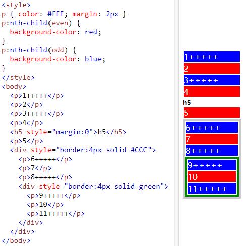
2、:nth-child(正数):nth-last-child(倒数):选择属于其父元素的指定第几个子元素的每个指定元素,常用使用如下::nth-child(2):正数第2个元素:nth-child(n):正数 >= 1 的元素,即:全部指定元素:nth-child(n+2):正数 >= 2 的元素,即:正数第2个以及后面全部指定元素:nth-child(-n+2):正数 <= 2 的元素,即:正数第1、2个指定元素:nth-child(2n-1):正数 奇数 的元素,等价于:nth-child(odd),即:正数数第1、3、5、...个指定元素:nth-last-child(2):倒数第2个元素:nth-last-child(n):倒数 >= 1 的元素,即:全部指定元素:nth-last-child(n+2):倒数 >= 2 的元素,即:倒数第2个以及前面全部指定元素:nth-last-child(-n+2):倒数 <= 2 的元素,即:倒数第1、2个指定元素:nth-last-child(2n):倒数 偶数 的元素,等价于:nth-last-child(even),即:倒数第2、4、6、...个指定元素
注意:2 中涉及的选择器会选择其父级元素下所有指定子元素,具体可参照下图:
/**
 * 只包含一个元素
 * :only-child 等价于 :first-child:last-child 等价于 :nth-child(1):nth-last-child(1)
 * 只包含一个元素
 */
ul >li:only-child {
/* ul >li:first-child:last-child { */
/* ul >li:nth-child(1):nth-last-child(1) { */
}
/**
 * 元素数 = 2 的全部元素
 */
ul >li:first-child:nth-last-child(2),
ul >li:first-child:nth-last-child(2) ~ li {
}
/**
 * 元素数 = 3 的全部元素
 */
ul >li:nth-child(1):nth-last-child(3),
ul >li:nth-child(1):nth-last-child(3) ~ li {
}
/**
 * 元素数 >= 8 的全部元素
 */
ul >li:first-child:nth-last-child(n+8),
ul >li:first-child:nth-last-child(n+8) ~ li {
}
/**
 * 元素数 <= 2 的全部元素
 */
ul >li:first-child:nth-last-child(-n+2),
ul >li:first-child:nth-last-child(-n+2) ~ li {
}
/**
 * 元素数 >= 5 && <= 6 的全部元素
 */
ul >li:first-child:nth-last-child(n+5):nth-last-child(-n+6),
ul >li:first-child:nth-last-child(n+5):nth-last-child(-n+6) ~ li {
}
九宫格图片展示
图片展示根据数量不同而自动适配不同布局效果,主要针对仅有1个、2个、4个的情况
布局根据 根据兄弟元素的数量来设置样式 实现
自适应根据 固定宽高比的自适应矩形 实现
/* 仅有1个元素 */
.album-wrap .rect-item:first-child:last-child {
  width: 100%;
}
.album-wrap .rect-item:first-child:last-child:after {
  padding-top: 50%;
}
/* 仅有2个元素 */
.album-wrap .rect-item:first-child:nth-last-child(2),
.album-wrap .rect-item:first-child:nth-last-child(2) ~ .rect-item {
  width: 50%;
}
/* 仅有4个元素 */
.album-wrap .rect-item:first-child:nth-last-child(4),
.album-wrap .rect-item:first-child:nth-last-child(4) ~ .rect-item {
  width: 50%;
}
.album-wrap .rect-item:first-child:nth-last-child(4):after,
.album-wrap .rect-item:first-child:nth-last-child(4) ~ .rect-item:after {
  padding-top: 70%;
}
输入框占位符交互
输入框聚焦时,输入框的占位符内容以动画形式移动到左上角作为标题
借助:placeholder-shown伪类实现
<div class="input-box">
  <input class="input-control" type="text" placeholder="姓名" />
  <label class="input-label">姓名</label>
</div>
/* 输入框美化 start */
.input-control {
  appearance: none;
  -webkit-appearance: none;
  background-color: #FFF;
  background-image: none;
  font-size: 14px;
  padding: 0 12px;
  height: 34px;
  line-height: 34px;
  box-sizing: border-box;
  border: 1px solid #DCDFE6;
  border-radius: 4px;
  outline: none;
  transition: border-color .2s cubic-bezier(.645, .045, .355, 1);
}
.input-control::placeholder {
  color: #C0C4CC;
}
.input-control:hover {
  border-color: #C0C4CC;
}
.input-control:focus {
  outline: none;
  border-color: #409EFF;
}
/* 输入框美化 end */

.input-box {
  display: inline-block;
  position: relative;
}
/* 使默认placeholder效果不可见 */
.input-control:placeholder-shown::placeholder {
  color: transparent;
}
/* 使用.input-label代替原来占位符 */
.input-label {
  color: #C0C4CC;
  font-size: 14px;
  position: absolute;
  left: 13px;
  top: 16px;
  pointer-events: none;
  line-height: 0;
  height: 2px;
  background-color: #FFF;
  transition: transform .2s cubic-bezier(.645, .045, .355, 1), color .2s cubic-bezier(.645, .045, .355, 1);
}
/* 输入框获取焦点 */
.input-control:not(:placeholder-shown) ~ .input-label,
.input-control:focus ~ .input-label {
  color: #409EFF;
  transform: scale(0.84) translate(-1px, -20px);
}
hover效果
/* hover效果 - 1,underline划过效果,核心:transform-origin 更改一个元素变形的原点 */
.link1 {
  display: inline-block;
  color: #409EFF;
  cursor: pointer;
  padding-bottom: 4px;
  text-decoration: none;
  position: relative;
}
.link1:after {
  content: "";
  position: absolute;
  width: 100%;
  height: 2px;
  bottom: 0;
  left: 0;
  transform: scaleX(0);
  background-color: #409EFF;
  transform-origin: bottom right;
  transition: transform .3s ease-in-out;
}
.link1:hover:after {
  transform: scaleX(1);
  transform-origin: bottom left;
}
background绘制虚线
.line {
  height: 1px;
  background: repeating-linear-gradient(to right, #F6F6F6, #F6F6F6 4px, transparent 4px, transparent 8px);
}
background-image网格背景
/* 通过background-image: linear-gradient绘制网格背景 */
.box {
  background-image: linear-gradient(0deg, #EEE 1px, transparent 0%),
                    linear-gradient(90deg, #EEE 1px, transparent 0%);
  background-size: 20px 20px;
  background-position: 0 1px;
}
steps步骤条
<div class="steps-wrap">
  <div class="steps-item finished">1</div>
  <div class="steps-item actived">2</div>
  <div class="steps-item">3</div>
  <div class="steps-item">4</div>
</div>
.steps-wrap {
  display: flex;
}
.steps-item {
  flex: 1;
  height: 40px;
  border-top: 1px solid transparent;
  border-bottom: 1px solid transparent;
  box-sizing: border-box;
  margin: 0 2px;
  position: relative;
  display: flex;
  align-items: center;
  justify-content: center;
  background-color: #EEE;
  color: #777;
}
.steps-item,
.steps-item:before,
.steps-item:after {
  transition: border-color .25s cubic-bezier(.71,-.46,.29,1.46),
              color .25s cubic-bezier(.71,-.46,.29,1.46),
              background-color .25s cubic-bezier(.71,-.46,.29,1.46);
}
.steps-item:first-child {
  border-left: 1px solid transparent;
}
.steps-item:last-child {
  border-right: 1px solid transparent;
}
.steps-item:last-child:before,
.steps-item:not(:first-child):not(:last-child):before,
.steps-item:first-child:after,
.steps-item:not(:first-child):not(:last-child):after {
  content: "";
  display: block;
  position: absolute;
  top: 0;
  width: 40px;
  height: 40px;
  box-sizing: border-box;
  border-top: 1px solid transparent;
}
.steps-item:last-child:before,
.steps-item:not(:first-child):not(:last-child):before {
  left: 0;
  z-index: 0;
  background-color: #FFF;
  border-right: 1px solid transparent;
  transform: rotateZ(45deg) scale(0.707) translateX(-21px) translateY(19px);
}
.steps-item:first-child:after,
.steps-item:not(:first-child):not(:last-child):after {
  right: 0;
  z-index: 1;
  background-color: #EEE;
  border-right: 1px solid transparent;
  transform: rotateZ(45deg) scale(0.707) translateX(19px) translateY(-21px);
}
.steps-item.actived.actived,
.steps-item.actived.actived:before,
.steps-item.actived.actived:after {
  border-color: #5898F7;
  color: #5898F7
}
.steps-item.actived.actived,
.steps-item.actived.actived:after {
  background-color: #E1EDFD;
}
.steps-item.finished.finished,
.steps-item.finished.finished:before,
.steps-item.finished.finished:after {
  border-color: #DDD;
  color: #999;
  background-color: #FFF;
}